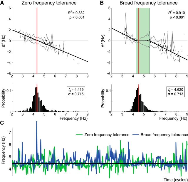
Figure 2.
Frequency tolerance patterns. Frequency tolerance plots are presented for representative ET (A) and PD (B) patients above their respective instantaneous frequency histograms. A, The ET patient was best fit by simple linear regression, where the zero-crossing coincides with median tremor frequency. B, The PD patient was best fit by a three component piecewise-linear function (see Materials and Methods; Fig. 1). Thin black lines indicate the mean instantaneous frequency difference (Δf) plotted against instantaneous frequency (see Materials and Methods). Gray lines indicate ± SD about the mean. Bold black lines indicate the best fit solution. Red vertical bars represent median tremor frequency in each case. Green highlight on the piecewise-linear fit represents the frequency tolerance region (cu − cl Hz). These examples were chosen to highlight divergent tolerance behavior despite approximately matched median tremor frequencies (fc) and frequency SDs (σ). C, Temporal evolution of frequency for the first 500 cycles of the ET (green) and PD (blue) datasets.

