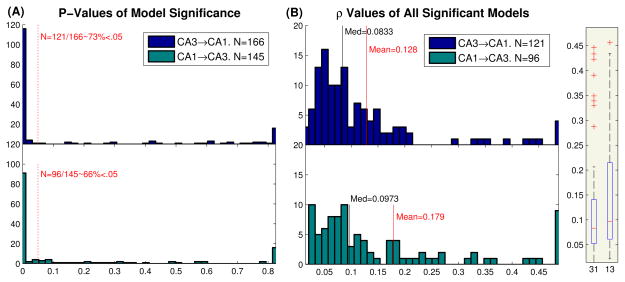
Fig. 7.
Comparison of CA3→CA1 and CA1→CA3 predictive power. (A) Histogram of CA3→CA1 (top) and CA1→CA3 (bottom) P-values, acquired from Monte Carlo simulations (see Fig. 4). Dashed red line is the 5% significance level. (B) Boxplot (right) and histogram (left) of the ρ values of all significant models. The black line shows the median, while the red line shows the mean

