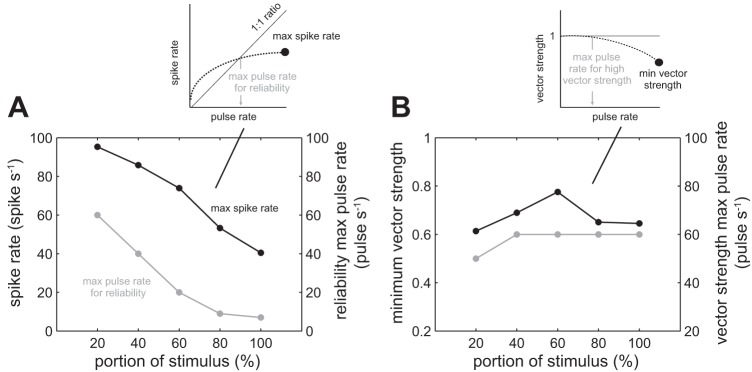
Fig. 8.

Measurements of change in maximum spike rate and vector strength over the portion of the pulse train stimulation duration. A: an afferent response to pulse stimulation can be characterized by 1) the maximum spike rate (black line), and 2) the maximum pulse rate for which an afferent can generate at least one spike for each pulse (gray line). The inset graph illustrates how the maximum spike rate (black circle) and maximum pulse rate (gray arrow) values were calculated. Both values decrease over time, represented as a percentage portion from the start of the stimulus, where 0% is the start of the stimulus and 100% is the end of the stimulus. B: the minimum vector strength (black line) and maximum pulse rate at which an afferent response is highly synchronized with the pulse train (vs. >0.9, gray line) does not show the consistent pattern of decrease seen in A. The inset graph illustrates how the minimum vector strength (black circle) and maximum pulse rate (gray arrow) values were calculated. The lines connecting the data points are for illustrative purposes.
