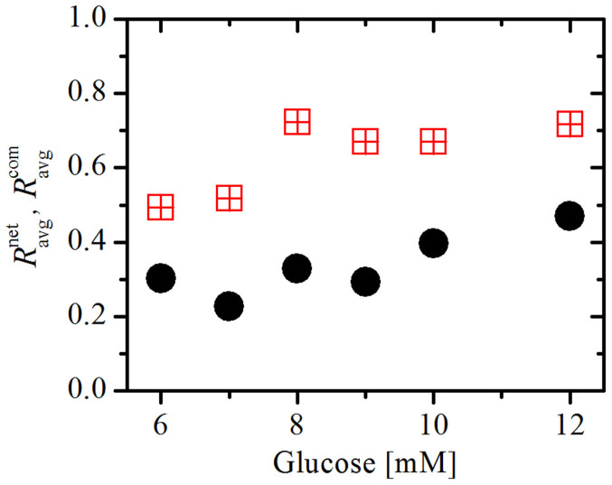
Figure 5. Average correlation between cell pairs in individual communities  (red squares) and between all connected cells in the network
  (black circles) at different concentrations of glucose.
In the calculation the connectivity threshold Rth was set to 0.7. The results are based on the average of four different functional networks (slices presented in Figs. 3 and S2) having altogether 722 nodes.

