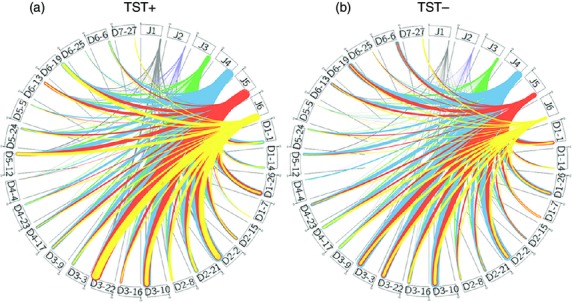
Figure 4.

Circos diagram for TST+ and TST− populations. The thickness of the connection line between the J1–J6 segments with the D segments correlates the number of occurrence of the particular pairing in (a) TST+ and (b) TST− populations. The grey, purple, green, blue, orange and yellow colours of the line represent J1–J6 segments, respectively.
