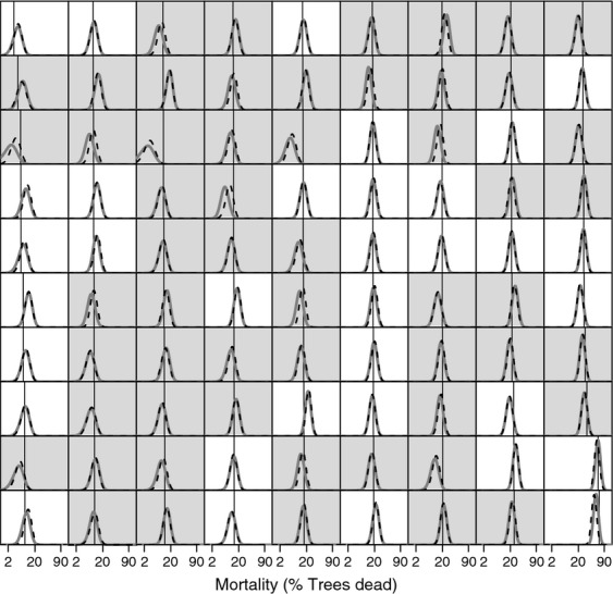
Figure 3.

Posterior predictive distributions and observed rate for overall mortality in the validation datasets of the 90 single-species models. Straight black lines show the observed proportion of dead individuals for each validation data set. Thick gray unbroken curves in the background are the posterior predictive distribution produced by models with vague priors. Thin black broken curves are posterior predictive distributions for equivalent models that included empirical data-derived priors. A gray background to the panel indicates the empirical data-derived prior improved model accuracy with respect to the validation data, while a white background indicates that the model with vague priors was more accurate. The horizontal axes are plotted on the complementary log–log scale to aid visualization of the probability distributions. Panels are ordered by increasing observed mortality in the validation set from top to bottom then from left to right.
