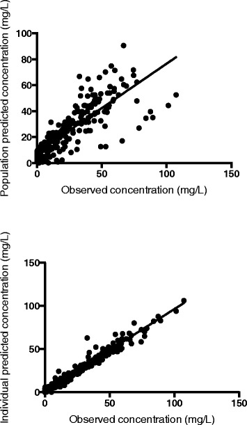
Figure 1.

Goodness-of-fit plots for the final covariate meropenem pharmacokinetic model. The top panel presents the population predicted concentrations versus the observed concentrations. The lower panel presents the individual predicted concentrations versus the observed concentrations. For both graphs, the dashed line represents the lines of best fit that have acceptable correlations (r2 = 0.96, P <0.0001 for population predicted concentrations and r2 = 0.64, P <0.0001, for the individual predicted concentrations using linear regression).
