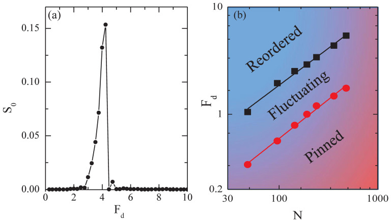
Figure 5.
(a) S0 vs Fd averaged over a fixed frequency window centered at f = 10 peaks in the fluctuating phase and drops upon approaching the dynamically ordered phase. (b) A log-log plot of the dynamical phase diagram Fd vs 1/N. Lines indicate a slope of 0.7. Lower curve (red circles): onset of yielding; upper curve (black squares): onset of the dynamically induced ordered phase. The fluctuating phase falls between the two curves.

