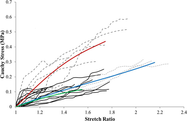
Figure 1.

The experimental data grouped by FTIR classification and the SEF curves fit to each data group. The light grey dashed lines represent the lightly calcified group and the blue line characterises the average curve of this group. The dark grey dashed lines represent the moderately calcified group and the red line characterises the average curve of this group. The black lines represent the heavily calcified group and the green line characterises the average curve of this group.
