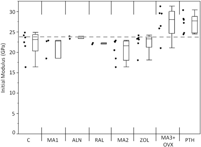
Fig. 3.

Initial modulus values for each group. MA3 + OVX and PTH had higher initial moduli than the other groups. Markers to the left represent individual sample data points. Box and whisker plots on right show the minimum, maximum, mean, and 25th and 75th quartiles for each group. Dashed line is the grand mean.
