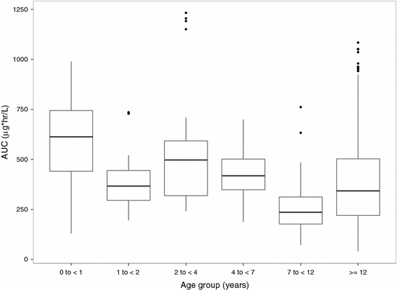
Fig. 4.

Comparison of tetrahydrobiopterin exposure by age groups. Whiskers represent 10th and 90th percentile, boxes represent 25th and 75th percentile, center lines represent median, and solid dots represent outliers. AUC area under the concentration–time curve
