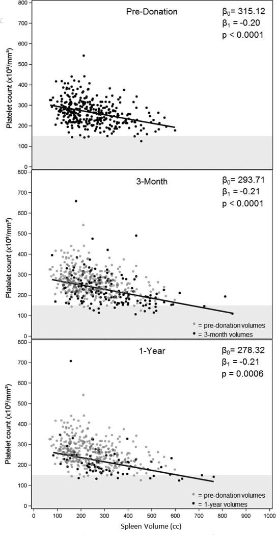
Figure 4.
Scatter plots of platelet counts vs. spleen volumes at 3 time points. On the 3-month and 1-year plots, the pre-donation values are plotted as gray dots (N=345) behind the post-donation values (black dots; 3-month: N=167, 1-year: N=76). Regression lines are shown, and the intercepts (β0), slopes (β1) and p-values are given. Values below the lower limit of normal for platelet counts (150) are shown in the gray horizontal band.

