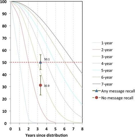
Figure 10.

Plot of proportion of nets surviving at endline (3.3 years after distribution) by exposure to the BCC intervention against standard decay curves. Decay curves are labelled according to where each curve hits the 50% line (dotted red line), e.g. the green curve crosses the median at 3 years since distribution, and is therefore the curve for a 3-year net.
