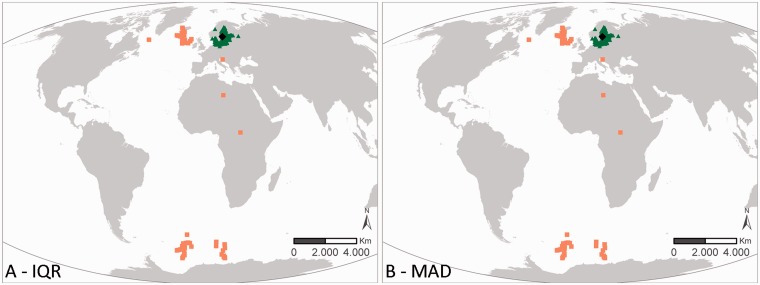
Figure 3.
Results of the geographic outlier analysis on the dataset ‘ICES Biological Community’. The left figure (A) represents the IQR approach, the right figure (B) represents the MAD approach. Black diamonds indicate the centroid of the investigated data, green triangles have been evaluated as OK, orange squares have been evaluated as possible outliers.

