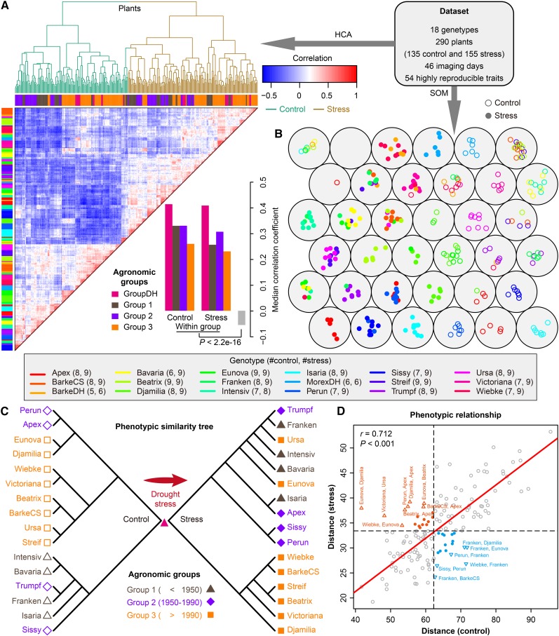
Figure 3.
Phenotypic Similarity Revealed by Genotype Similarity.
(A) and (B) Clustering analysis of phenomic profiling data. HCA (A) and a six-by-six self-organizing map (SOM) (B) were used to reveal the phenotypic similarity of all the investigated barley plants based on the highly reproducible traits. In (A), colored bars along the top of the heat map reflect the sampled agronomic group assignment (groups 1 to 3 and DH) as labeled. Colored bars along the left indicated the corresponding genotypes of individuals as listed in the key. The lower panel shows the median correlation values among individual plants from the same agronomic groups and different groups. In (B), plants with similar genotypes or treatments tend to be at nearby map locations. Control and stress plants are colored and indicated in blank and filled points, respectively. The numbers in the key show the number of plants from the same genotypes belonging to the control or stress group.
(C) Phenotypic similarity trees showing the phenotypic relationship of plants from agronomic groups 1 to 3 under control (left; blank shapes) and stress (right; filled shapes) conditions. The trees were constructed from overall phenotypic distance matrices (see Methods).
(D) Scatterplot indicating the degree of correlation of phenotypic distance between genotypes under both control (x axis) and stress conditions (y axis). Mantel test was performed to examine whether the phenotypic distances in the two conditions correlate with each other. P value was calculated with Monte-Carlo simulation (with 10,000 permutations). Genotype pairs that are far away from the regressed line (red) are labeled and colored (orange, small distances in control and large distances in stress; blue, otherwise).

