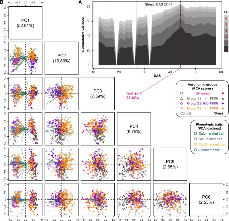
Figure 4.
Phenotypic Profile Reflects Global Population Structures in the Temporal Scale.
(A) Projections of top six PCs based on PCA of phenotypic variance over time. The percentage of total explained variance is shown. The stress period is indicated by the dashed box.
(B) Scatterplots showing the PCA results on DAS 44 (explained the largest variance). The first six PCs display 83.3% of the total phenotypic variance. The component scores (shown in points) are colored and shaped according to the agronomic groups (as legend listed in the box). The component loading vectors (represented in lines) of each variable (traits as colored according to their categories) were superimposed proportionally to their contribution. See also Supplemental Figures 6 and 7.

