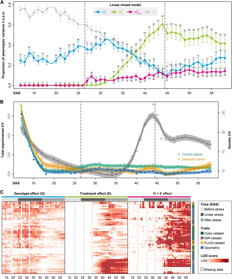
Figure 5.
Dissection of the Sources of Phenotypic Variance.
(A) Dissecting the phenotypic variance over time by linear mixed models. For phenotypic data before stress treatment,  is confounded with
  . Filled circles represent average variance of each component computed over all traits, and solid lines represent a smoothing spline fit to the supplied data. Error bars represent the se with 95% confidence intervals. The numbers of traits with significance at P < 0.001 are indicated above the bars. The stress period is indicated in dashed box.
(B) The total experimental CV (colored in gray) and genetic CV across lines (green for control, orange for stressed, and blue for the whole set of plants) over time. Data points denote the average CV value over all geometric traits. Solid lines denote the loess smoothing curves and shadow represents the estimated se.
(C) Statistical significance of genotype effect (left), treatment effect (middle), and their interaction effect (right), as detected by linear mixed models. The shading plot indicates the significance level (Bonferroni corrected P values) in terms of LOD scores (-log probability or log of the odds score). Traits are sorted according to their overall effect patterns. Trait identifiers are listed on the right, which are given according to Figure 6A. G, genotype; E, environment (treatment).

