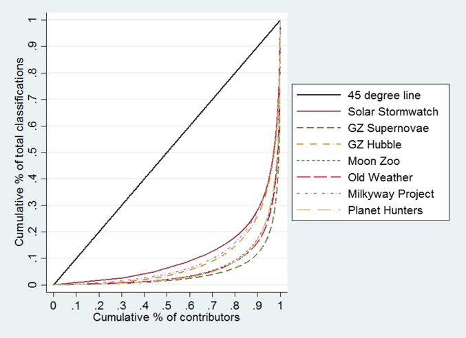
Fig. 3.
Lorenz curves for the distribution of users’ total classification counts in each project. The Lorenz curve indicates the cumulative share of classifications (y axis) made by a particular cumulative share of users (x axis). The stronger the curvature of the Lorenz curves, the stronger the inequality in contributions. For comparison, we also show the 45° line, which corresponds to total equality, i.e., all users contribute the same amount.

