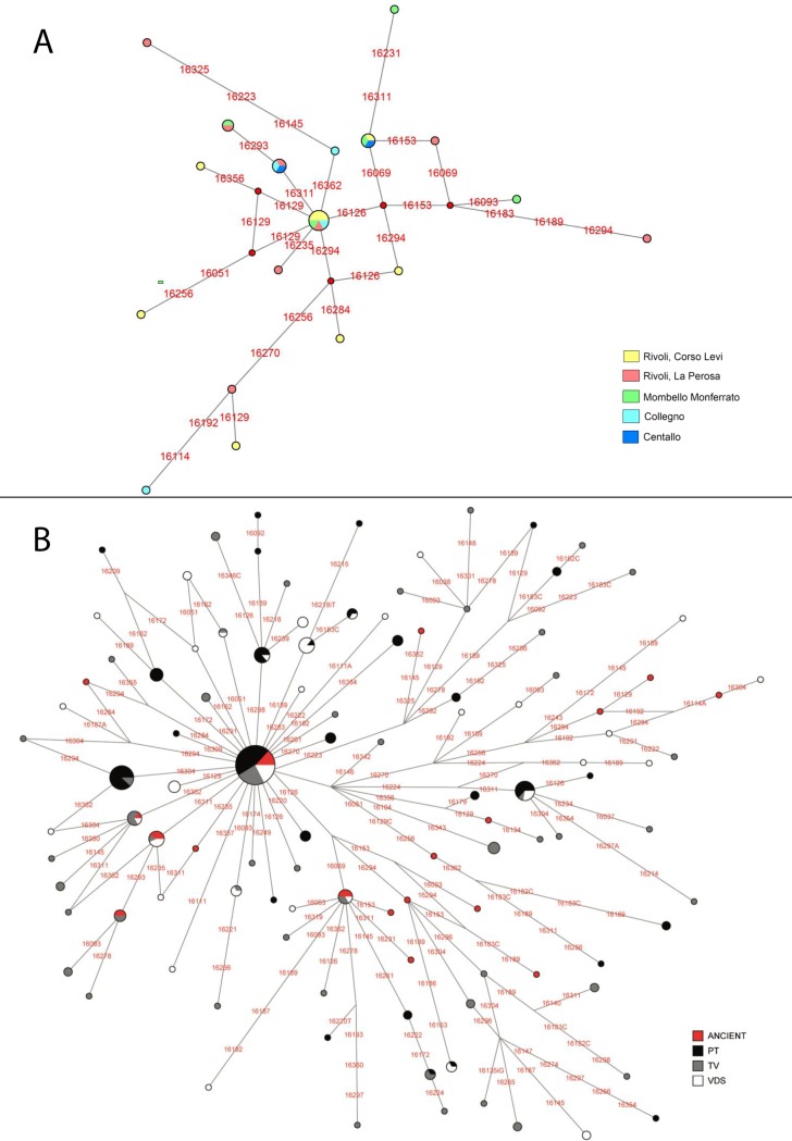
Figure 3. Median Joining Networks.
Node sizes are proportional to haplotype frequencies. Variable positions are indicated along links that connect haplotypes. Nucleotide changes are specified only in the case of transversions. (A) Median Joining Network for the medieval sample. Different colors represent archaeological sites where the haplotype is present (see legend). Segregating sites are shown in red. (B) Median Joining Network of the ancient (colored in red) and modern samples (Trino Vercellese in grey; Postua in black and Val di Susa in white). Major haplogroups are named according to the current nomenclature.

