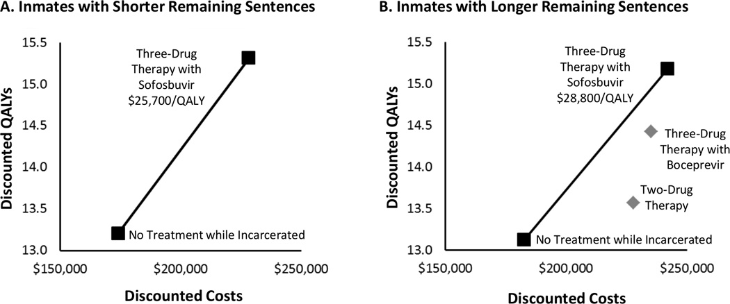
Figure.

Cost-effectiveness results. The graphs show discounted QALYs (y-axis) and discounted total expected lifetime costs (x-axis) for each treatment strategy for inmates with short remaining sentences (<1.5 y) and those with long remaining sentences (≥1.5 y). The line segments make up the efficient frontier. The squares depict strategies on the frontier, and incremental cost-effectiveness ratios (i.e., the ratio of the additional costs of an intervention and its additional effects compared with the next best alternative) are reported. The diamonds represent strategies not on the efficient frontier, which cost more and provide less benefit than a strategy or combination of strategies on the frontier. QALY = quality-adjusted life-year.
