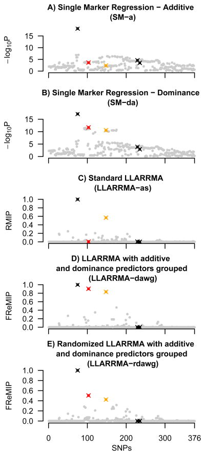
Figure 2.
Results of five methods applied to an example dataset from simulation study G. Plots show SNP location in a simulated locus against SNP score, where SNP score is defined for single marker methods (sub plots A, B) as −log10 of the p-value (logP), and for multi-SNP methods as the inclusion probability (RMIP or FReMIP). SNPs for which a true signal was simulated are shown as crosses, in black (additive effect), orange (major allele dominant), and red (minor allele dominant); all other (background) SNPs are shown gray dots.

