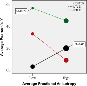
Figure 3.

Tract correlations in subgroups with high and low average FA. The size of the circles is proportional to the average FA (minimum and maximum values are indicated in the plot). [Color figure can be viewed in the online issue, which is available at http://wileyonlinelibrary.com.]
