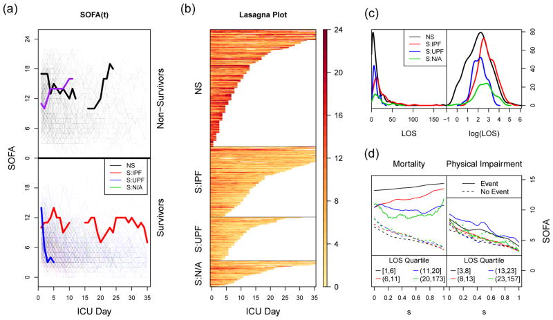
Figure 1.
Exploratory plots. In plots (a), (b), and (c), NS = non-survivors, S:IPF = survivors with impaired physical function, S:UPF = survivors with unimpaired physical function, and S:N/A = survivors not assessed for physical function. The first two panels display the first 35 days of SOFA data as (a) a spaghetti plot and (b) a lasagna plot. Both subjects are separated into four groups, based on their values for the two outcomes (in-hospital mortality and physical impairment). In the spaghetti plot, color indicates outcome category. Four subjects are highlighted, and lines are used to connect adjacent measurements on the same subject, with gaps representing days where SOFA information was not available. In the lasagna plot, rows correspond to individual subjects, and darker colors are indicative of higher SOFA scores, i.e., poorer health. (c) Density estimates of the length of stay, stratified by the two outcomes, multiplied by the number of subjects in each stratum. (d) Mean SOFA functions that have been linearly compressed to a common domain, stratified by both outcome and ICU length of stay, for both mortality and physical function. Each LOS stratum contains approximately one quarter of the subjects for each outcome.

