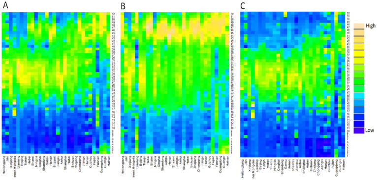
Figure 3. Heat maps of diarrhoea epidemiology data in China, from 2005 to 2012.
(A) Time series of weekly diarrhoea cases in the total population, sorted by decreasing latitude from left to right. (B) Time series of weekly diarrhoea cases in children <5 years, sorted by decreasing latitude from left to right. (C) Time series of weekly diarrhoea cases in persons > = 5 years, sorted by decreasing latitude from left to right. Week 1 is the first week of January. Colour palette: “High” refers to relatively higher number of diarrhoeal cases within each province, and “Low” refers to relatively lower number of diarrhoeal cases within each province.

