Figure 1.

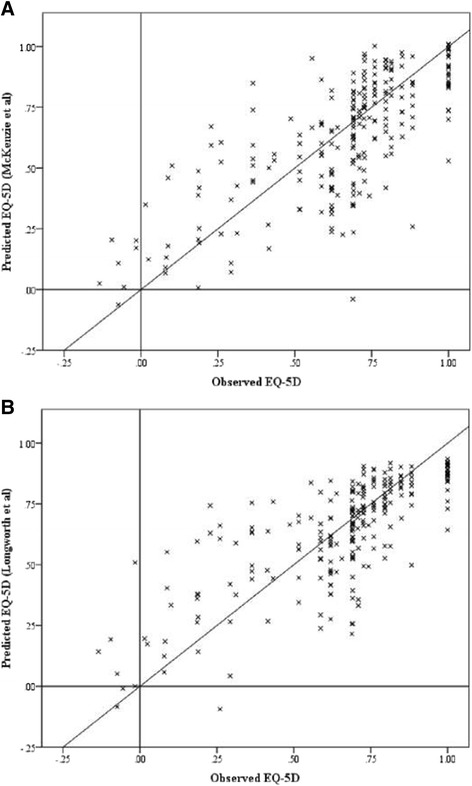
Scatter plots of observed against predicted values (A) Longworth (B) McKenzie. (n.b. diagonal line represents x = y, i.e. the result of perfect mapping).

Scatter plots of observed against predicted values (A) Longworth (B) McKenzie. (n.b. diagonal line represents x = y, i.e. the result of perfect mapping).