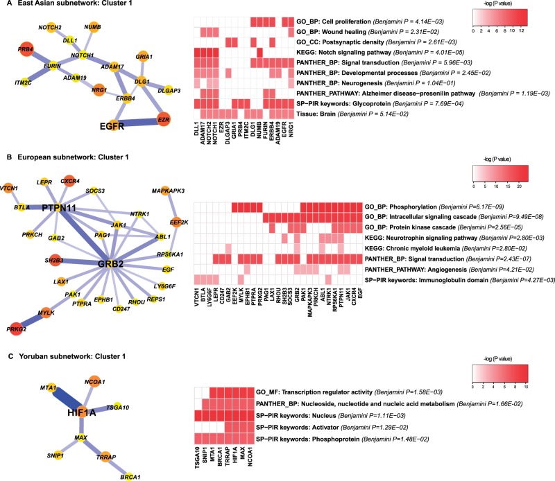
Fig. 6.—
Candidate pathways of recent coselection identified by functional enrichment analysis in (A) EAS (B) CEU, and (C) YRI. In each subfigure, the coselection cluster is plotted at the left. The right side shows a 2-D heatmap of the functional enrichment matrix. For each functional category in a row, the nominal P-values of enrichment are log transformed and are shown as a color gradient. Benjamini corrected P-values are annotated right to the functional categories. Genes from the clusters, in the columns of the heatmap are either labeled with the color gradients if they appear in the corresponding functional category or left unlabeled if not.

