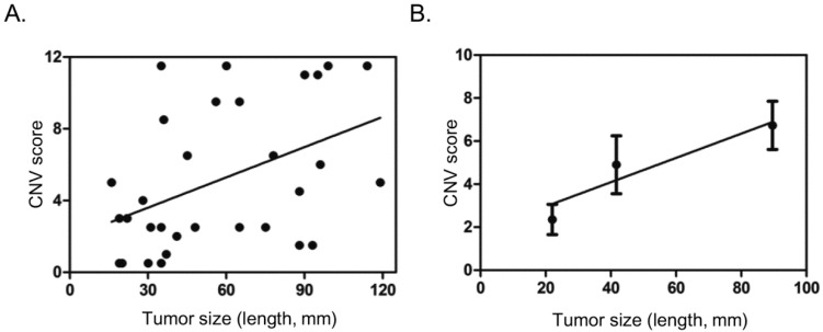
Figure 3.
Correlation of CNV scores with tumor size. A. Scatter dot plot showing distribution of CNV scores and tumor size (length in mm). B. Average tumor size and CNV score in three different groups based on tumor size (<=30 mm, 31-60 mm, >60 mm), showing general trend of increase in CNV score with tumor size. Dots and error bars represent Means and SD of each group.

