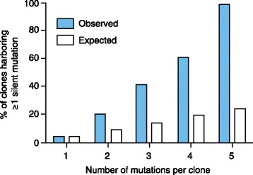
Figure 4.

Silent mutations increase with the total number of mutations per cell clone. The graph represents the total number of silent mutations per clone (x-axis) and the percentage of clones with at least one silent mutation (blue bars). White bars represent the expected percentage of mutations. Adapted with permission from Khorashad et al. [52].
