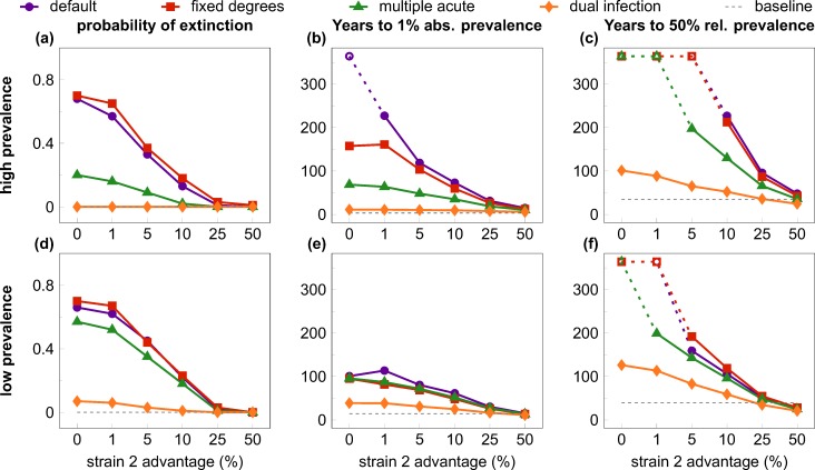
Fig 3. Quantifiers of the “first comer advantage”.
All quantifiers are plotted against the relative transmission rate advantage of the second (invader) strain, with alternative scenarios to test interference mechanisms. Rows show results from the high (top row) and low prevalence (bottom row) settings; columns depict three different quantifiers; scenarios are coded by symbols and colour. In the default scenario (purple lines and dots) the invader strain faced a high risk of extinction (A, D) and experienced very slow growth to 1% absolute prevalence (B, E) and to 50% relative prevalence (C, F) at low values of transmission rate advantage, compared with the initial growth of the resident virus (dashed gray lines). The effect was largely abrogated with unhindered superinfection and co-existence (dual infection scenario; orange lines and diamonds), and, in the high-prevalence setting, partially mitigated by allowing for repeated “acute stage” peak infectivity after superinfection (multiple acute scenario; green lines and triangles); fixing the degree distribution of the contact network (fixed degrees scenario; red lines and squares) had little effect compared with the default scenario. Increasing the relative transmission rate advantage of the invader strain also decreased the inhibition effects: values comparable to the single-strain baseline were observed around 25%-50% transmission advantage. Data in B-C and E-F depict medians from 1000 simulation runs (excluding those where the invader virus went extinct). Parameters are listed in Table 1; scenarios are described in detail in the main text. The maximum length of simulations was 19,000 weeks (~365 years); empty symbols indicate where the invader strain did not reach the threshold prevalence by the end of the simulation in the majority of the cases.

