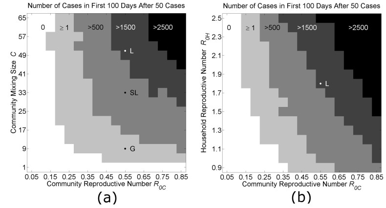
Phase Diagrams of Parameter Space.
Each phase diagram shows the average growth of cases in the first 100 days after the outbreak is established (when the total number of cases exceeds 50 cases). Panel (a): In the first diagram, the community mixing size C and the community reproductive number R0C are varied as all other model parameters are held fixed (H=16, R0H=1.8). The locations of parameters used to fit the growth curves for Liberia (L), Sierra Leone (SL) and Guinea (G) in Fig. 3 are indicated along the vertical line R0C=0.55. ). Panel (b): In the second diagram, the household reproductive number R0H and the community reproductive number R0C are varied as all other model parameters are held fixed (H=16, C=51). The locations of the parameters fitting the growth curve for Liberia is indicated at the cross-section of the vertical line R0C=0.55 and the horizontal line R0H=1.8. In both panels, the unshaded white areas are the regions of phase space where fewer than 1% of simulations resulted in 50 cases. Each pixel is colored according to the average growth of cases in the first 100 days after the outbreak for 5 simulations.

