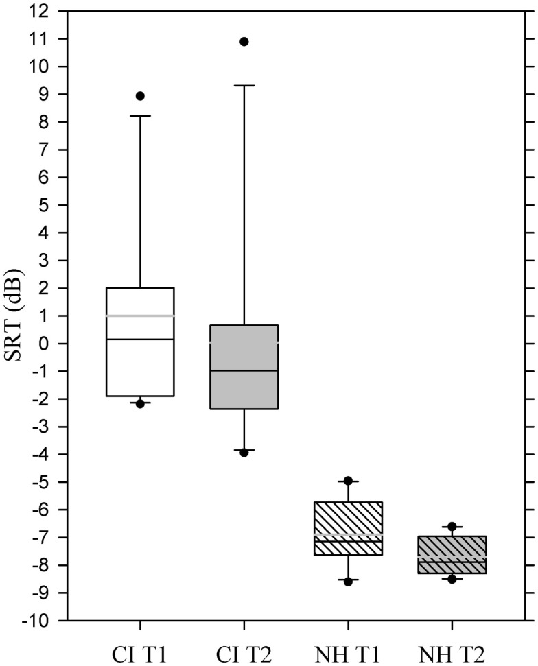
Figure 4.
Box plot showing mean speech recognition thresholds for the two experimental groups at T1 and T2. Whiskers (error bars) above and below the box indicate the 90th and 10th percentiles. Solid black line represents the median, gray line represents the mean. Dots represent outlying points. Note that a more negative value corresponds to a better performance.

