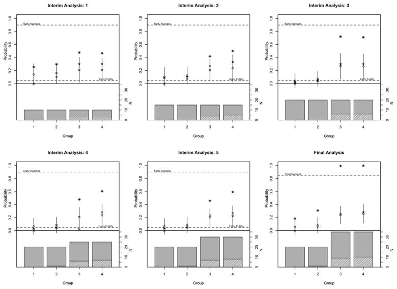
Figure 2.
Example 2. Barplot shows sample size in each group where the height of the solid bar shows number of patients enrolled and height of the hashed bar shows number of patients who achieved a response. Upper part of the plot shows observed response (‘x’), fitted response (‘o’) and 2 times the standard deviation (line). Asterisks indicate Pr(p > pmid) for the interim analyses and Pr(p > p0) at the final analysis.

