
Fig 1. Graphical representation of gene expression patterns in the four data sets.
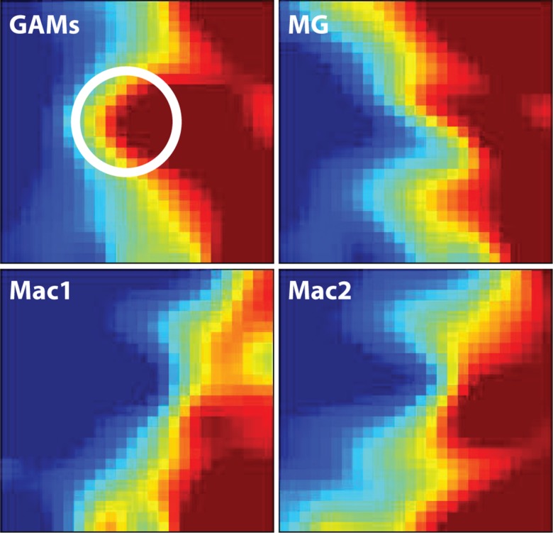
The four GEDI maps show that the gene expression patterns of GAMs and naive microglia are more similar to each other than both macrophage datasets (blue colour indicating low and red colour high mRNA expression levels). The white circle highlights a central cluster of highly expressed genes in GAMs that is different from naive microglia. GAMs: glioma-associated microglia/macrophage microarray data; MG: naive microglia microarray data; Mac1: external data set from Keller, Mazuch et al. 2009; Mac2: external data set from Young, Eksmond et al. 2012.