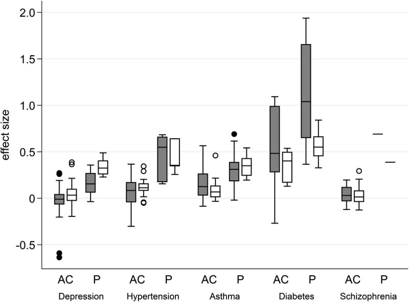
Figure 1.

Box-whisker plot of effect sizes of each disease. Gray box: observed effect sizes, white box: predicted effect sizes, AC: effect size of the pairing of a test drug and an active comparator, P: effect size of the pairing of a test drug and placebo. The boxes show interquartile ranges. The horizontal line across each box denotes the median, and vertical lines extending above and below each box indicate the minimum and maximum values. Dots above and below the boxes are outliers.
