Figure 1.

Geographic Location, mtDNA-Haplogroup Frequencies, and Average Ancestry Proportions in the HGDP Populations
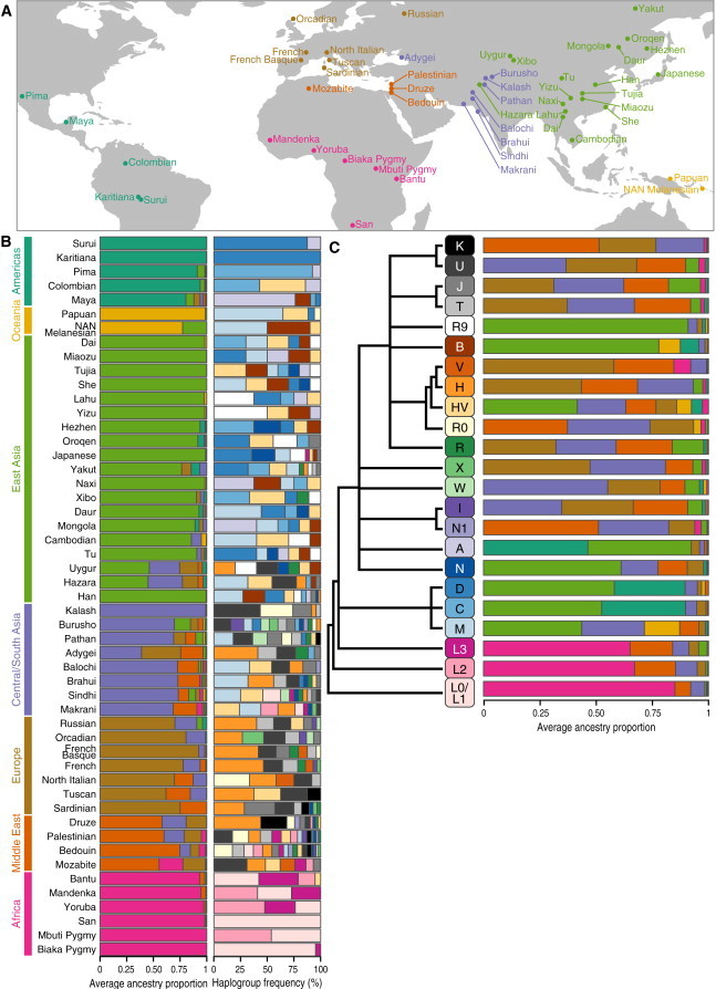
(A) World map showing sample locations (points) for each of the populations included in the HGDP (labels).
(B) Left column: barplots of continental-ancestry proportions averaged within each HGDP population. Barplots are colored by continental region (labeled by colored bars on the left) and sorted by continental ancestry. Right column: barplots of haplogroup frequencies within each population. Barplots are colored by mtDNA haplogroup (labeled by the haplogroup tree in C).
(C) Barplots of continental-ancestry proportions averaged within each mtDNA haplogroup within the HGDP dataset. Barplots are colored by continental region (labeled by colored bars on the left of A). The unscaled phylogeny on the left shows the relationships between the mtDNA haplogroups.32
