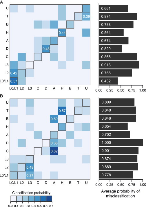
Figure 4.

Misclassification Probabilities in the HGDP and 1KGP
Each cell (row i, column j) denotes the probability that a sample experimentally determined as haplogroup i is classified as haplogroup j on the basis of a fitted logit model. Cells are colored by increasing classification probabilities from white to blue (see key at bottom). Diagonal entries (gray outlines) are the probability of being classified correctly. Barplots on the right show the average probability of misclassification for each haplogroup, which is the total of all non-diagonal values in each row. The top 10% of non-zero classification probabilities are labeled (white text).
(A) Misclassification in the HGDP.
(B) Misclassification in the 1KGP.
