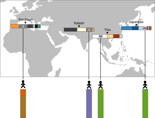
Figure 5.

mtDNA-Haplogroup Membership Might Not Be Associated with Autosomal Ancestry Proportions
Each point on the map marks a sampled population, and the population’s mtDNA-haplogroup frequencies are shown in the horizontal barplots below (color key corresponds to haplogroups in Figures 1C and 3B). One individual from each population, along with a vertical barplot of the individual’s autosomal-ancestry proportions, is shown below the map. The two individuals from haplogroup R9 have highly similar autosomal-ancestry proportions, whereas those from haplogroup J are very different.
