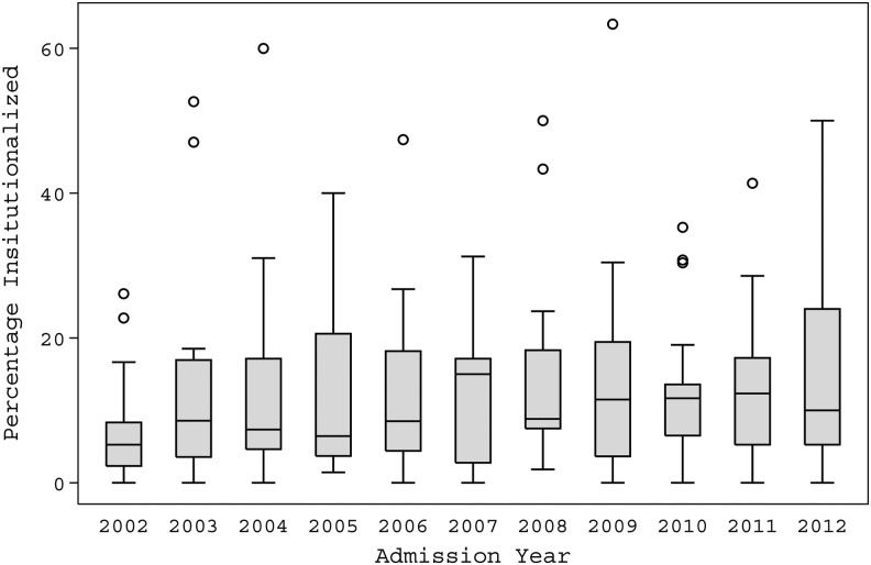
FIG. 2.
This graph depicts the range in the percentage of people discharged from the various Traumatic Brain Injury Model Systems facilities each year. The horizontal line in the inside of each box is the median among the centers for that year; the upper and lower limits of each box are the 25th and 75th percentiles among the centers for that year; the length of the “whiskers” is equal to 1.5 times the interquartile range (75th percentile minus 25th percentile), while dots beyond the whiskers are called “outlying values.” The value for each center was weighted by the number of people admitted to the center that year.

