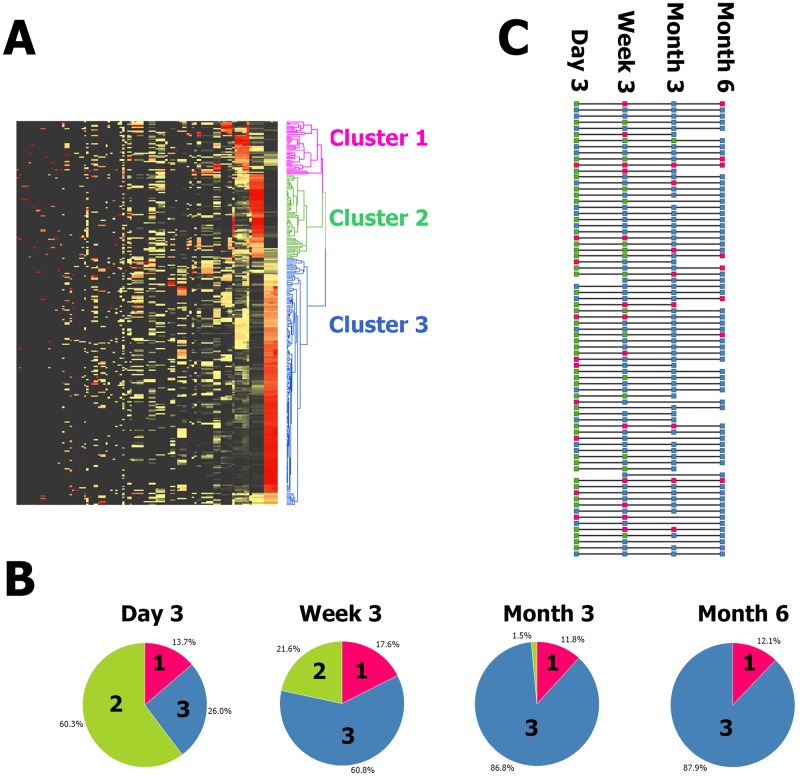
FIG 1 .
(A) Unsupervised clustering of all samples and all taxa reveals three clusters. Z score-normalized data for all detected taxa are displayed in a heat map with black denoting the minimum value, yellow denoting the average value, and red denoting the maximum value. Each row is a sample, and each column is a taxon. Both taxa and samples are clustered by UPGMA with euclidean distance. A sample dendrogram is shown on the right. The sample dendrogram is pruned at distance 238 (chosen by eye) to reveal three deep-rooted clusters. The clusters are pink, green, and blue and numbered 1, 2, and 3 from the top down. (B) The time point was strongly associated with cluster membership (P = 1.38−20). Pie charts show the proportions of samples at each time point that were classified in each of the three clusters. Sections are colored as in panel A, i.e., magenta for cluster 1, green for cluster 2, and blue for cluster 3, as well as labeled by cluster number. For example, 60% of the day 3 samples were in cluster 2 and no month 6 samples were in cluster 2; meanwhile, 88% of the month 6 samples were in cluster 3 and 26% of the day 3 samples were in cluster 3. (C) Individuals progress from cluster 2 to cluster 3 with some intermediate cluster 1 and much interindividual rate variation. Each horizontal line represents one subject. Each square is colored to reflect the cluster the subject was classified into at each time point. The squares are colored as in panels A and B, i.e., magenta for cluster 1, green for cluster 2, and blue for cluster 3. A progression from cluster 2 (green) to cluster 3 (blue) is typical, but some subjects start at cluster 3 (blue) and some progress through cluster 1 (magenta).

