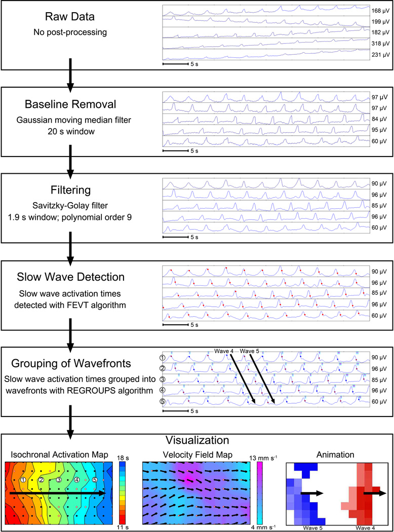
Figure 5.
An example of HR mapping analysis, based on intestinal multi-electrode recordings. First, raw data is filtered to remove baseline wander and extraneous noise.58 Slow-wave ‘activation times’ are then marked at the point of steepest negative descent (red dots), before ‘grouping’ of individual events into their propagation cycles. Algorithms and software are now available to automate these time-intensive tasks,59,60 but careful manual review and correction are still currently required for accurate results in humans. Three forms of visualization are illustrated. Isochronal activation maps (bottom left), which quantify propagation patterns in spatiotemporal detail. Each dot represents an electrode, and each color band shows the ‘isochronal interval’ (area propagated per unit time; here 0.5 s).60 Velocity field maps (bottom center) display speed using a color gradient and propagation direction using arrows at each electrode.61 Propagation patterns may also be animated (bottom right),45 with multiple waves passing through this mapped area concurrently. From O’Grady G, Angeli T, Du P et al. Abnormal initiation and conduction of slow wave activity in gastroparesis, defined by high-resolution electrical mapping. Gastroenterology. 2012;143:589–598; with permission.

