Figure 2.
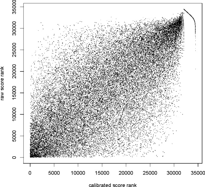
Calibration changes the ranking of PSMs. Scatter plot of calibrated versus raw XCorr score rank of each optimal PSM from 34 469 +3 spectra from the yeast data set. The tail at the right end of the graph consist of 2438 PSMs with the same minimal calibrated score (maximal p-value), so their calibrated rank is somewhat arbitrarily determined within that set of poorly scored PSMs. Similar figures (not shown) were obtained for all other data sets that we examined.

