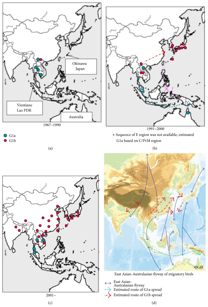
Figure 2.
The distribution of subclusters of genotype 1 JEV in each time period, 1967–1990, 1991–2000, and 2001–. The blue dots represent G1a and red dots G1b represent isolates analyzed in this study and published strains. The lower right panel shows an altitude map with the East Asian-Australasian flyways of migration cited from http://www.ozcoasts.gov.au/indicators/shorebird_counts.jsp and estimated migration routes of G1a and G1b.

