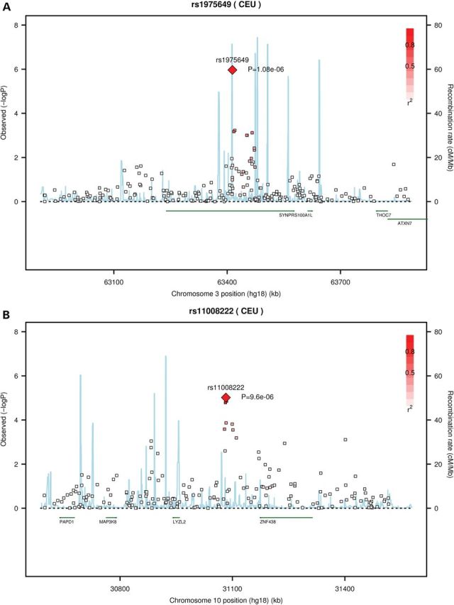
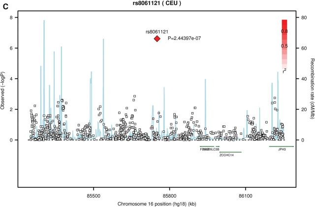
Figure 1.

Regional association plots for three loci with genome-wide significant or suggestive associations with LSLs. Each pane: (A) rs1975649 (B) rs11008222 (C) rs8061121, shows the association statistic (−log10 P for the likelihood ratio test) from Stage 1 for the variant (diamond) and nearby markers (squares) on the left y-axis. The red shading indicates linkage disequilibrium (r2) between the variant and nearby markers. The light blue lines indicate recombination rates across each region in 1000 Genomes Pilot 1 CEU data (right y-axis). Chromosome position (hg18) and nearby genes are shown on the x-axis.

