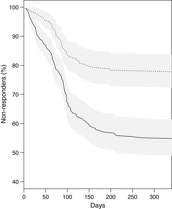
Figure 3.

Variation of the percentage of non-responders, as a function of time after receipt of the questionnaire. Subjects with the best expected (8,12] (−) or lowest expected (0,4] (−−-) response rates are shown. Grey areas represent the 95% confidence intervals for each curve. The 2 curves differ significantly (log-rank test, p =0.002).
