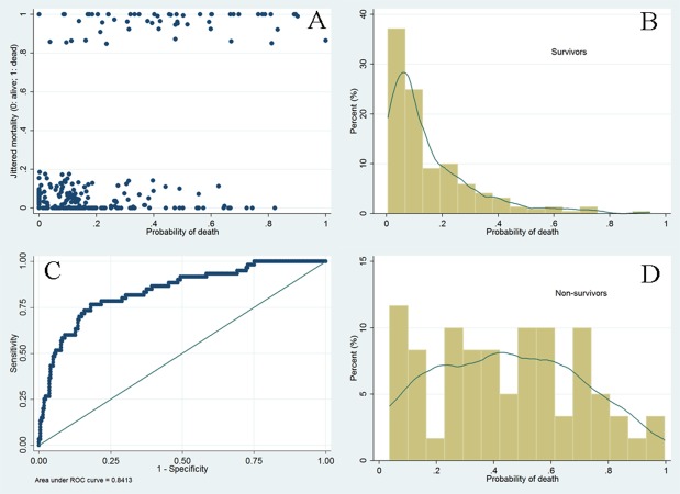
Figure 4. Graphical presentation of model discrimination.
The scatter plot (A) showed that survivors were mostly gathered at the region with lower probability of death (left x-axis), indicating a good negative predictive value of the model. The ROC curve (C) showed that the diagnostic performance of the model was excellent, with an area under ROC of 0.84.

