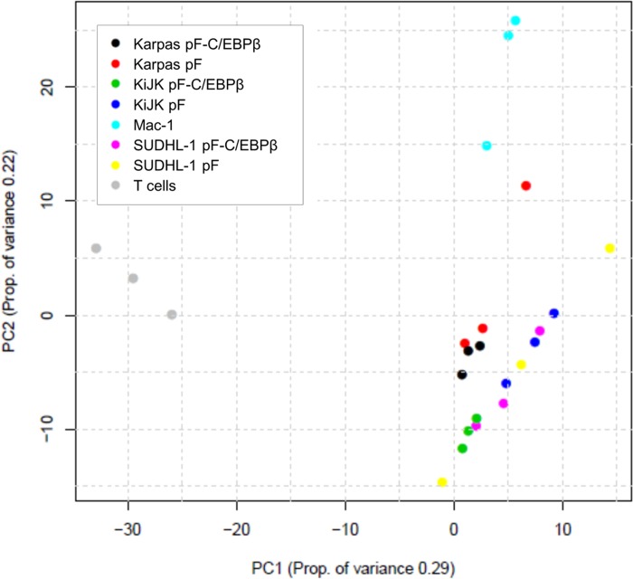
Fig 1. Principal Component Analysis.
2D scatter plot shows principal component analysis (PCA) of miRNA deep sequencing data. The two axes represent the first two principal components (PCs) from the principal component analysis. The values in brackets indicate the amount of variation in the data that can be explained by the PC. The percent of variation given by a particular PC is indicated in the axis label. Points are colored by sample type. Samples were analyzed in triplicates. The graph shows a clear separation by principal component 1 between normal T cells (grey) and ALCL cells. The principal component 2 separates ALK+ and ALK- ALCL (light blue).

