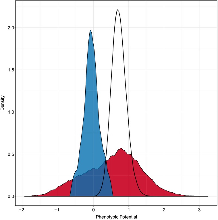
Figure 2.

Distribution of phenotypic potential scores
A kernel density plot of the phenotypic potential scores from all DAmP strains is shown in red. Random permutation of the same dataset yields the probability density of phenotypic potentials shown as the black curve. In blue is the distribution of phenotypic potentials from a wild-type control strain.
