Figure 3.

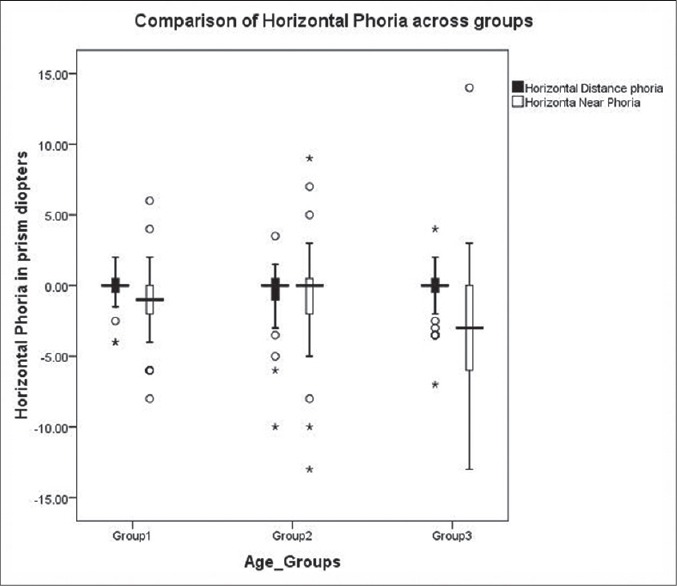
Comparison of horizontal phoria across three age groups. In the above box and whisker plot, the lower and upper end of the box indicates first and third quartile and the horizontal line between them denotes the median value

Comparison of horizontal phoria across three age groups. In the above box and whisker plot, the lower and upper end of the box indicates first and third quartile and the horizontal line between them denotes the median value