
Figure 1. Outline of the DREVI method.
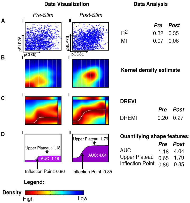
All panels represent the relationship between pCD3ζ and pSLP76 in CD4+ naïve T-lymphocytes from B6 mice with CD3 and CD28 before stimulation (AI-DI) and 30 seconds after stimulation (AII-DII). (A) Each dot in the scatterplot represents the value of a single cell, where the x-axis represents the amount of pCD3ζ levels and the y-axis represents the amount of pSLP76 levels. (B) The same data is shown using kernel density estimation with red corresponding to dense regions and blue corresponding to sparse regions. The x-axis is partitioned into slices (in practice we use 256 such slices). (C) A DREVI plot of the same data, renormalizing the density estimate to obtain a conditional-density estimate of the abundance of pSLP76 levels given the abundance of pCD3ζ levels. Within each column, dark red (maximal color) represents the highest density in that slice. A response function (white curve) is fit to the region of highest conditional density. The top bar plots the marginal distribution of pSLP76 levels and the right bar plots the marginal distribution of pS6 levels. (D) Following curve fitting, the inflection point, upper plateau and area under the curve can be computed and compared between conditions.