
Figure 4. DREVI and DREMI reveal the dynamics of TCR signaling.
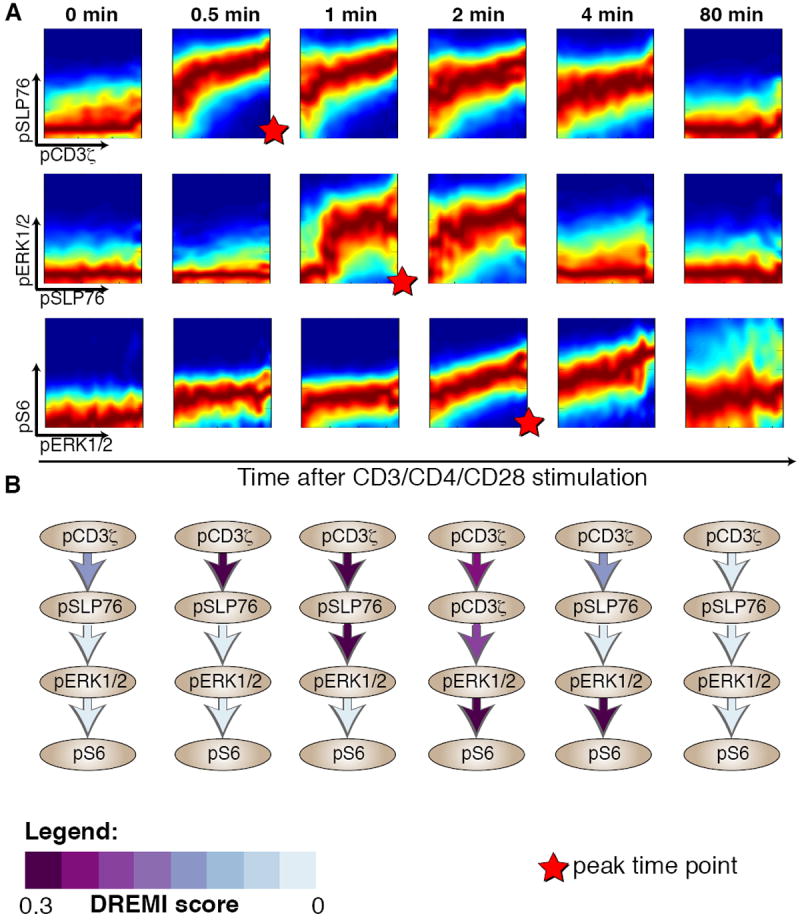
The pCD3ζ -pSLP76-pERK-pS6 cascade at various time points following after TCR activation. All panels represent data from CD4+ naïve T-lymphocytes from B6 mice with CD3, CD28 and CD4 crosslinking. (A) Each row represents an edge in the cascade and each column a time point after TCR activation. DREVI plots show the dynamics of TCR signaling; edges change their strength and shape as signaling proceeds. The scale used is the same as in figure 1, with dark red representing the behavior of the majority of cells, whereas the other colors depict the heterogeneity and spread of the response. (B) Network diagrams with DREMI values indicated on each edge, columns matching the same time points as in A. For each edge, the color indicates the computed DREMI values, more purple indicating a higher DREMI score. DREMI captures peak signal transfer timings in each of the 3 edges.